Trip Request Widget
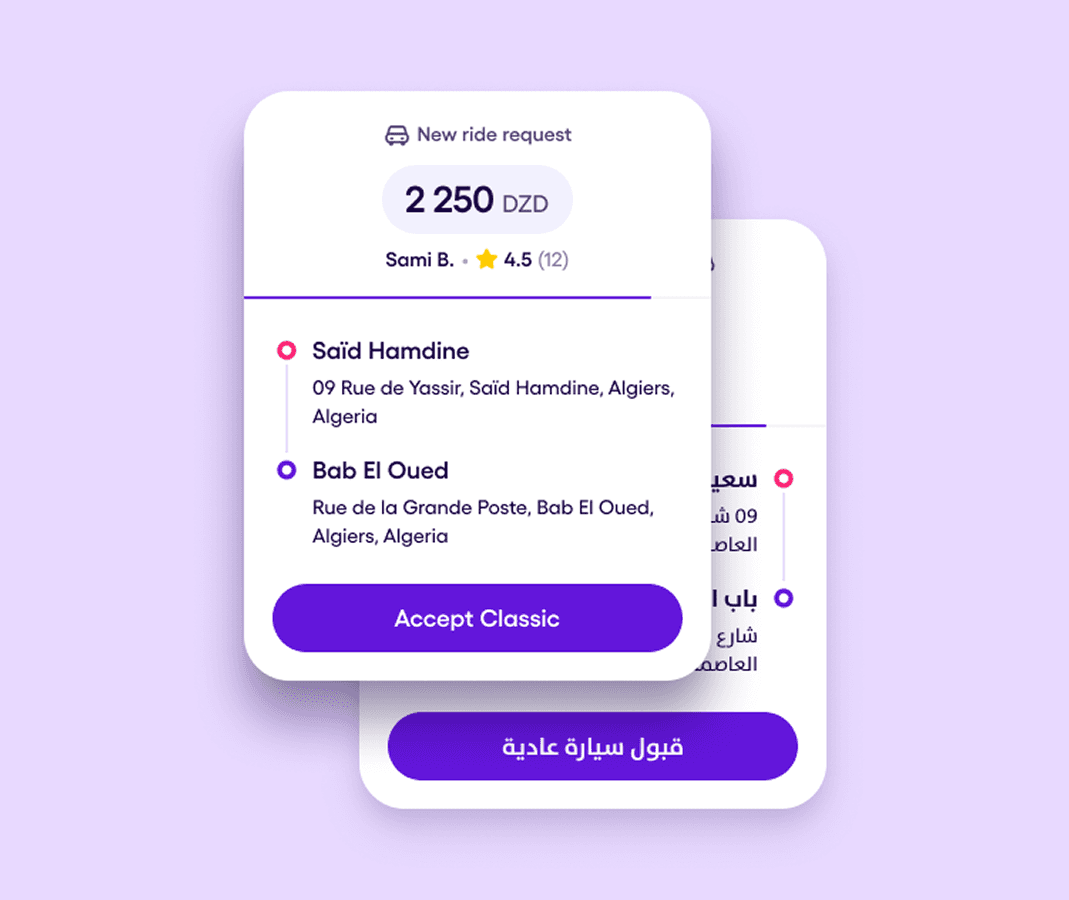
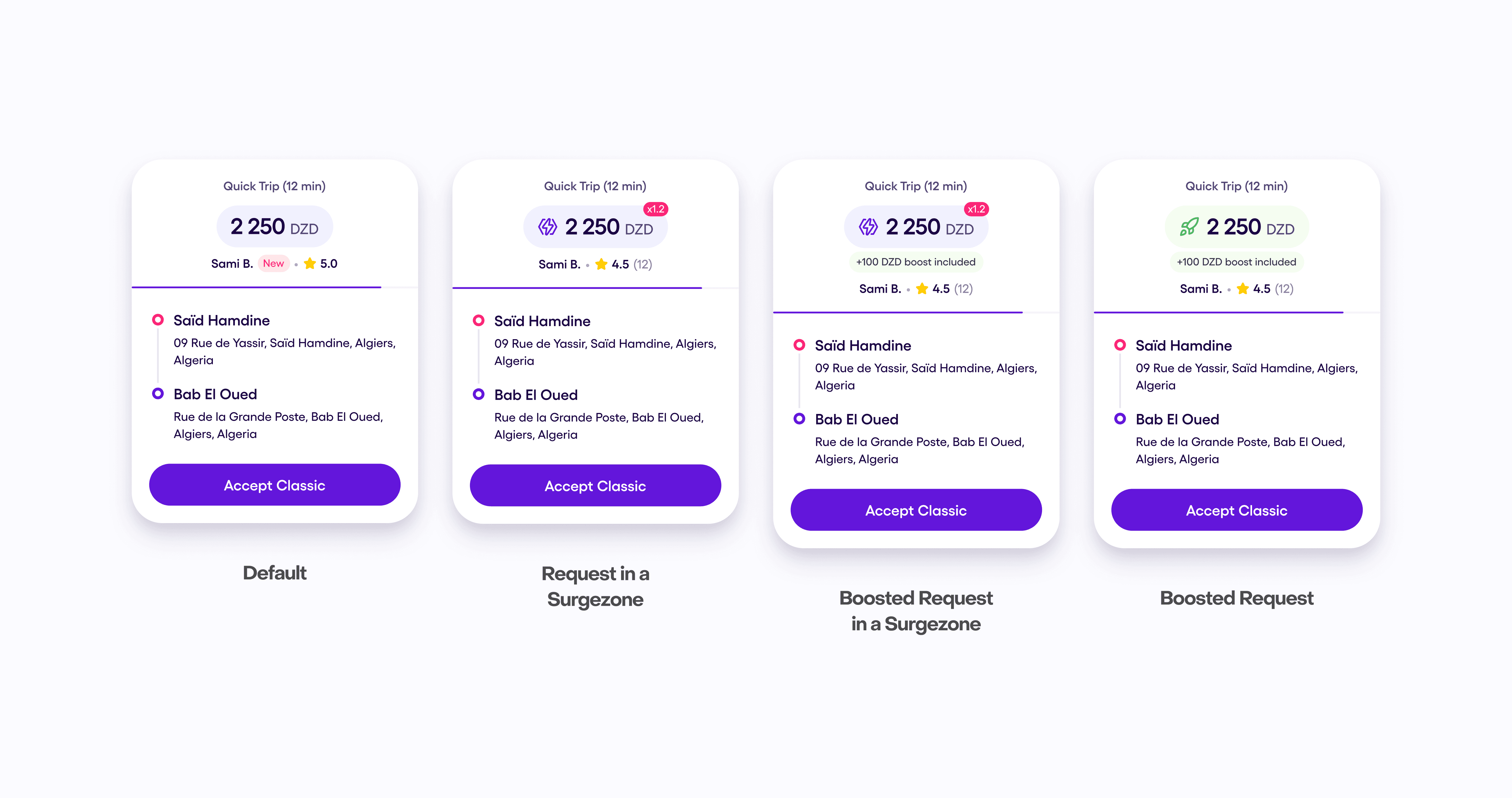
The trip request widget is one of the most critical components in the Yassir Driver App. It determines how quickly and confidently drivers can evaluate a request while on the move. During user testing and driver interviews, we identified several issues in the existing widget — especially around visual clarity, hierarchy, and readability while driving. This update focuses on addressing those pain points to support faster, safer decision-making.
Problem & Goals.
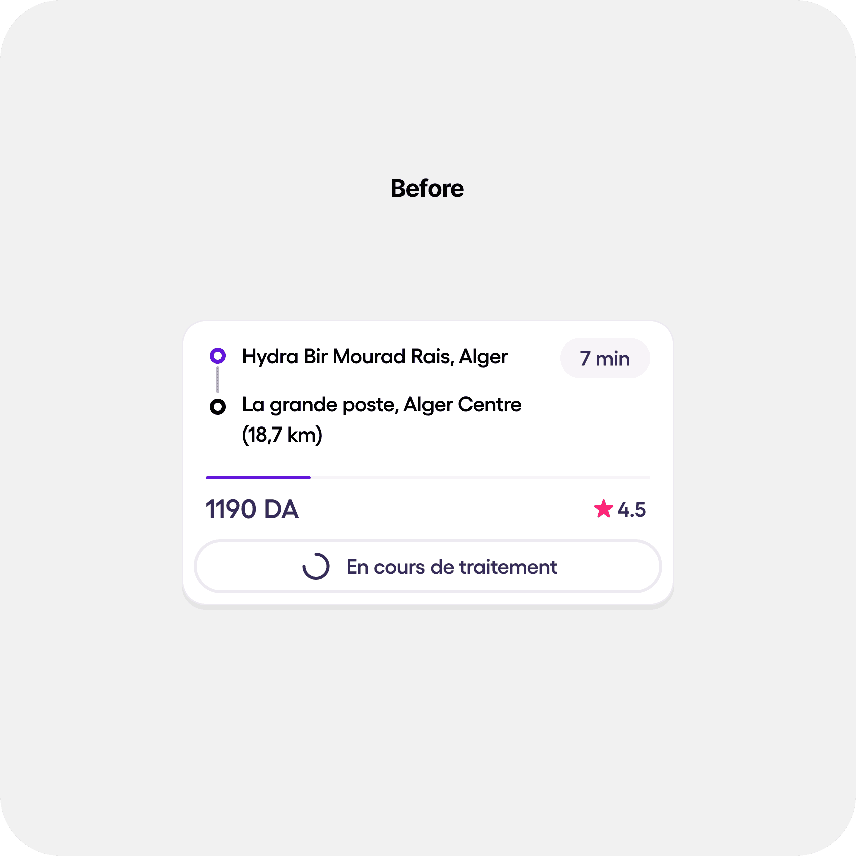
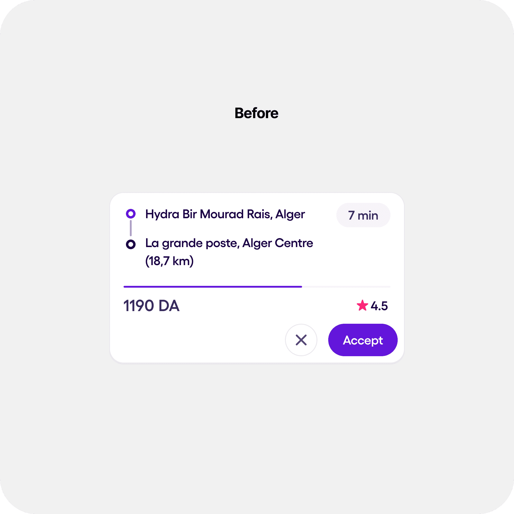
The previous trip request widget lacked a strong visual hierarchy and did not prioritize essential trip details. Drivers had difficulty scanning elements like price, pickup, drop-off, and passenger rating, which slowed their reaction time and increased cognitive load during driving.
The dense layout, small fonts, and low-emphasis CTA made the experience feel cramped and harder to interpret quickly — especially in fast-paced or high-stress conditions.
Research Phase.
1. Methods
- In-depth driver interviews
- Real-time ride-along observations
- Usability testing with prototype comparisons
- Analysis of acceptance behavior patterns
2. Findings
Pain points from the research:
- Scattered attention — Drivers’ eyes jumped between price, rating, pickup, and drop-off
- Price was too low on the screen, making it harder to see at a glance
- Acceptance button was small and low-emphasis, reducing confidence
- Small typography made key information difficult to read while driving
These insights confirmed the need for a clearer, more structured, and more prominent information layout.
“Everything felt cramped — I had to scan too much just to figure out if the trip was worth it.”
— User feedback
How might we redesign the widget so drivers can evaluate a request instantly, without scanning multiple areas of the screen?
Ideation & Exploration.
The exploration phase focused on:
- Making price the primary focal point
- Creating a top-to-bottom flow: Price → Driver/Passenger Info → Pickup & Drop-off
- Scaling touch targets for safer in-motion interaction
- Adapting the widget for multiple request types (default, surge, boosted trips)
- Improving spacing, contrast, and micro-interactions
Each iteration aimed to reduce scanning time while increasing confidence and visual clarity.
Impact & Outcomes.
While this project doesn’t include quantitative metrics yet, early tests showed:
- Drivers assessed trip details faster and with higher confidence
- Increased visibility of price improved decision-making speed
- Larger CTA button reduced missed or delayed accept actions
- Overall widget felt more modern, readable, and aligned with real driving conditions
Rider App Revamp