Rider App Revamp
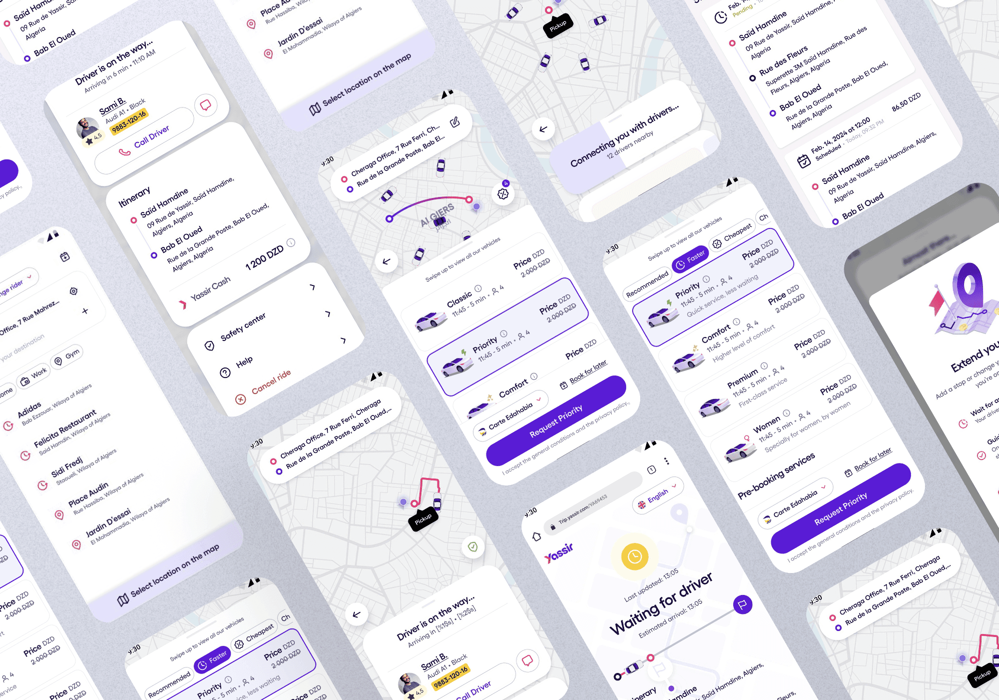
This project focused on revamping the Yassir Rider App to deliver a smoother, more intuitive user experience. The main objectives were to modernize the interface, introduce interactive feedback, and align the design with the SEFAR Design System. The legacy app lacked visual consistency and real-time cues, which often left users confused about what was happening. Through this redesign, we aimed to enhance clarity, build trust through interactions, and create a scalable, system-aligned experience across key ride flows.
Problem & Goals.
Problem
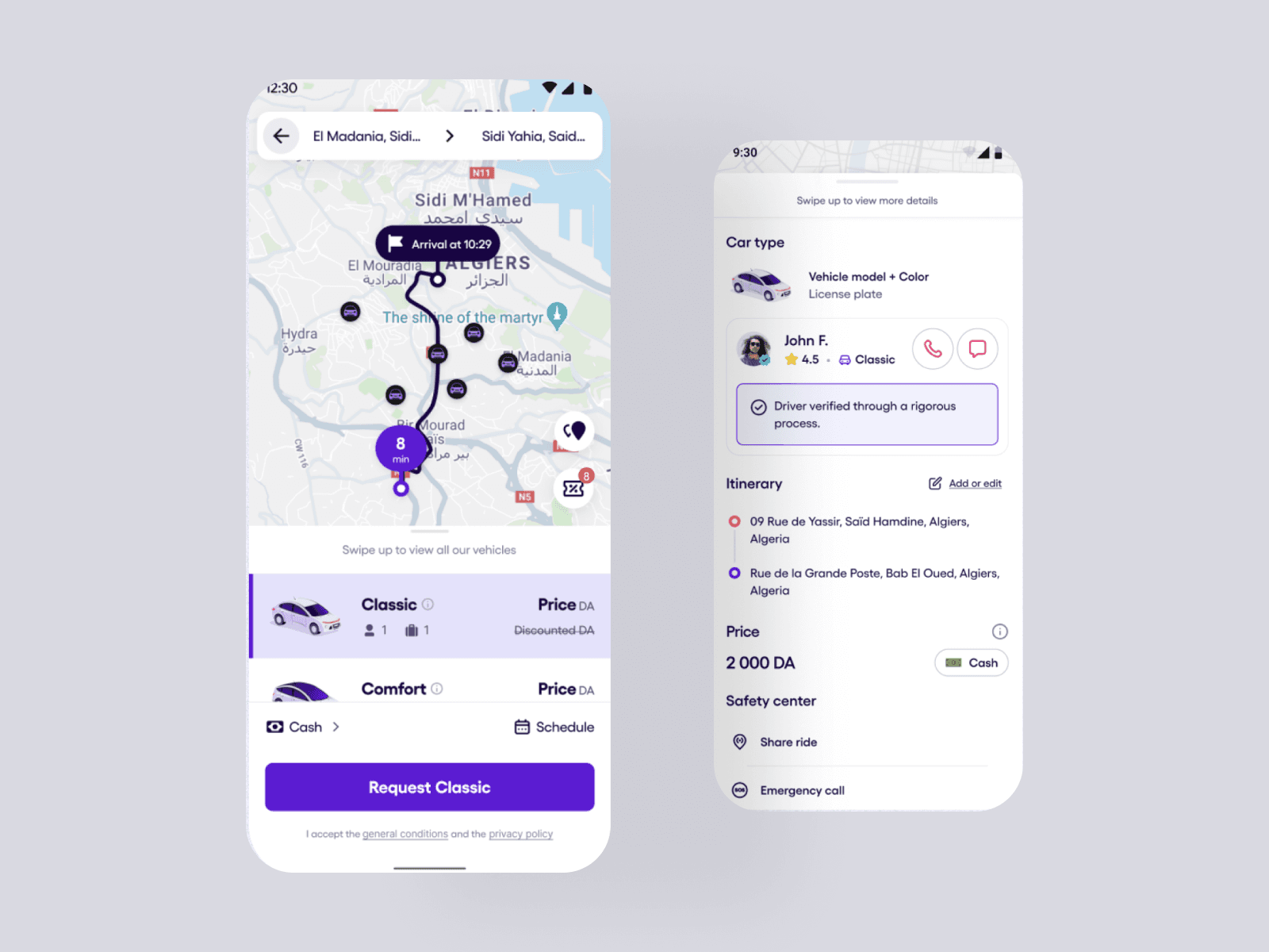
Riders frequently reported not knowing what was happening during key trip stages — especially while waiting for a driver or approaching pickup. The old experience lacked real-time cues, used outdated UI patterns, and often created doubt around whether the app was working at all.
Goal
- Reduce uncertainty during ride request & pickup stages
- Modernize UI using SEFAR Design System
- Improve NPS and ride completion rate
- Ensure visual and interaction consistency across platforms
A fragmented visual system meant the interface wasn’t speaking the same language as the brand — a critical gap during a moment of rider vulnerability.
Research Phase.
1. Methods
To understand where the experience was breaking, we combined qualitative and quantitative insights:
- 12 User Interviews
- Analytics Review
- Heuristic Evaluation
- Competitive Analysis
2. Insights
What we uncovered painted a clear picture
Felt unsure whether the ride request was actually processing
Abandoned requests if “Connecting to driver” >10s
Users said the UI showed “too much information at once”
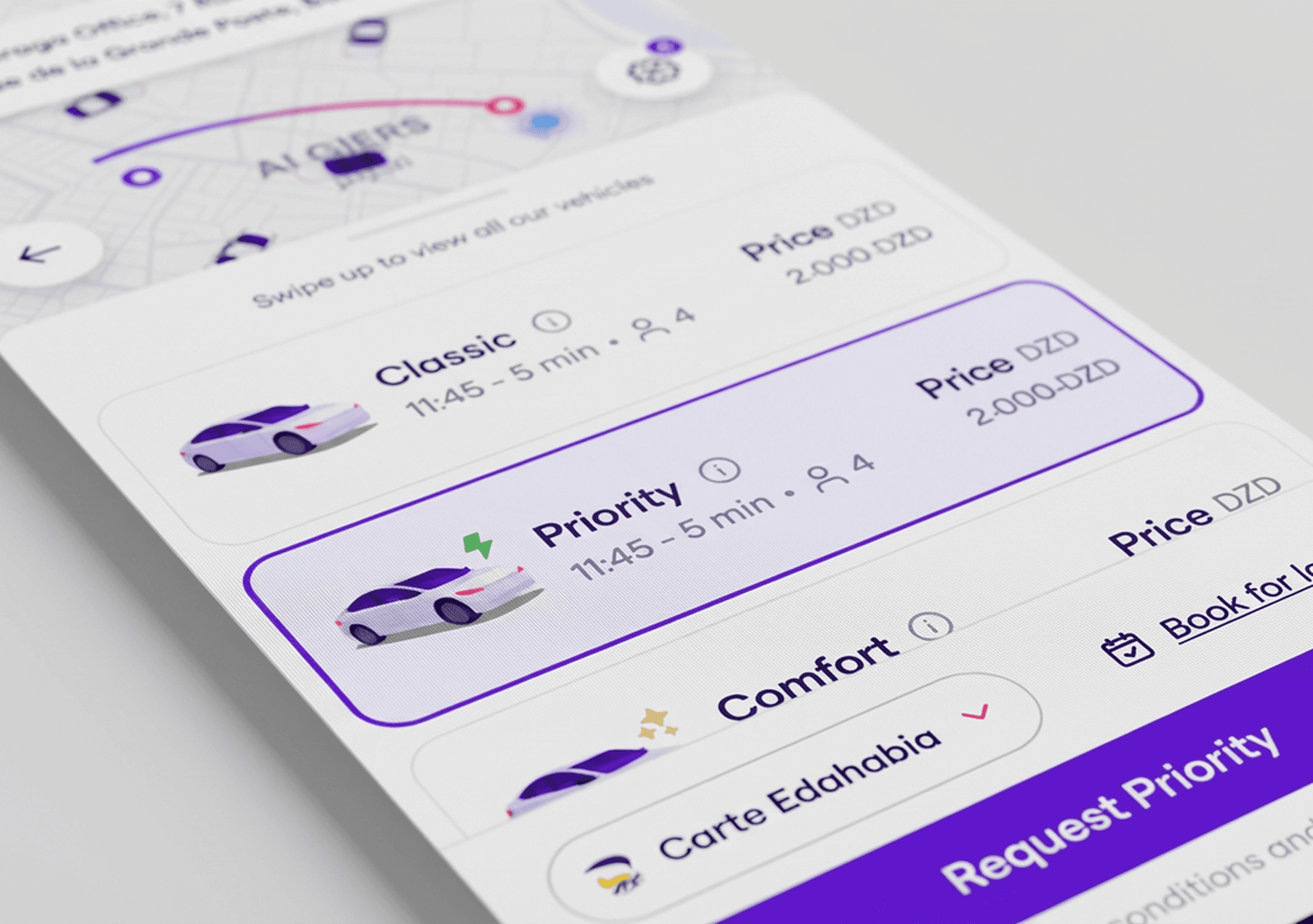
“It feels like nothing is happening — I can’t tell if my ride is on the way or if the app is stuck.”
— User feedback
How might we design a visually clear, emotionally reassuring ride experience that builds trust through motion and feedback?
Ideation & Exploration.
Our team ran a fast-paced Crazy 8s session with PMs and developers. Despite dozens of sketches, one insight kept coming back: the ride experience should feel state-driven and sequential, not static.
We mapped a clean, linear progression:
Each state needed its own identity, animation logic, and clarity thresholds.
Prototyping & Testing.
Once we had a direction, we built high-fidelity prototypes and tested them with riders.
The results validated the redesign:
- SUS score jumped from 64 → 86
- 80% of testers felt “more in control”
- Perceived waiting time dropped from 12s → 8s
Motion, clarity, and hierarchy played a bigger role in trust than we expected.
Final Design Highlights.
What we transformed:
- Streamlined the entire booking flow, removing redundant screens
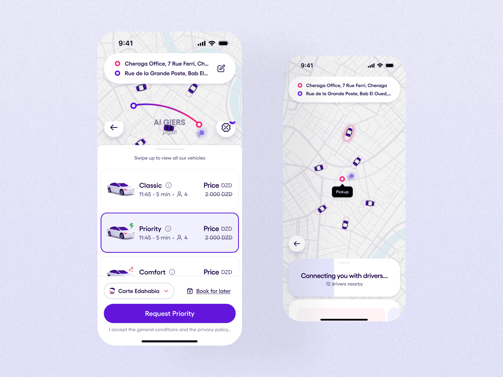
- Introduced clear state transitions (driver found → arrival → in-ride)
- Added micro-interactions that convey live feedback
- Designed contextual ads for waiting periods
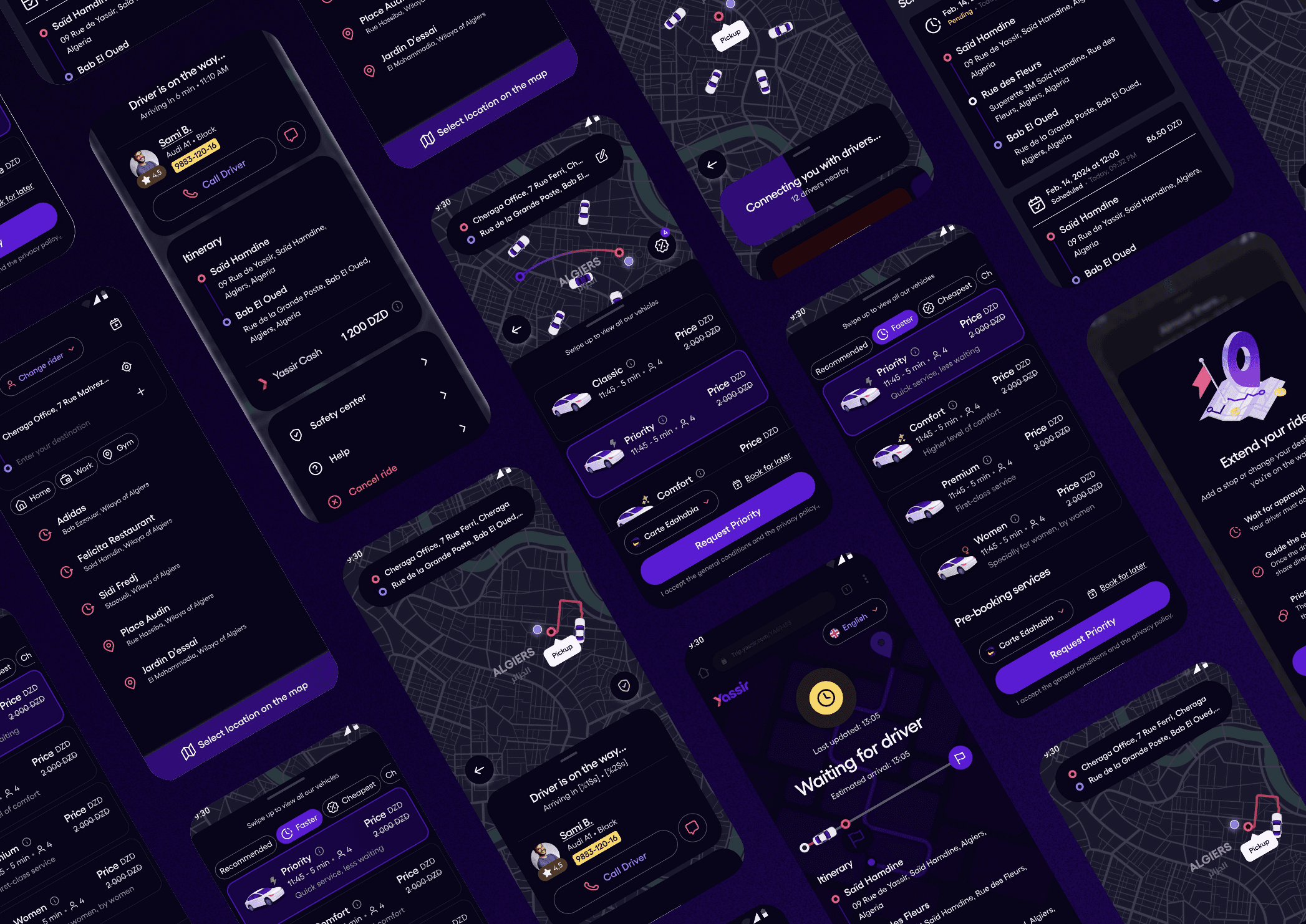
- Fully aligned the UI with the SEFAR Design System (type, spacing, motion rules)
The ride no longer felt static — it now guides the user, responds to them, and visually communicates progress at every step.
Impact & Outcomes.
(After 4 Sprints)
The numbers reflected the change instantly:
Ride completion rate
Cancellation rate
Reduction in developer implementation time
Landing Page