Landing Page
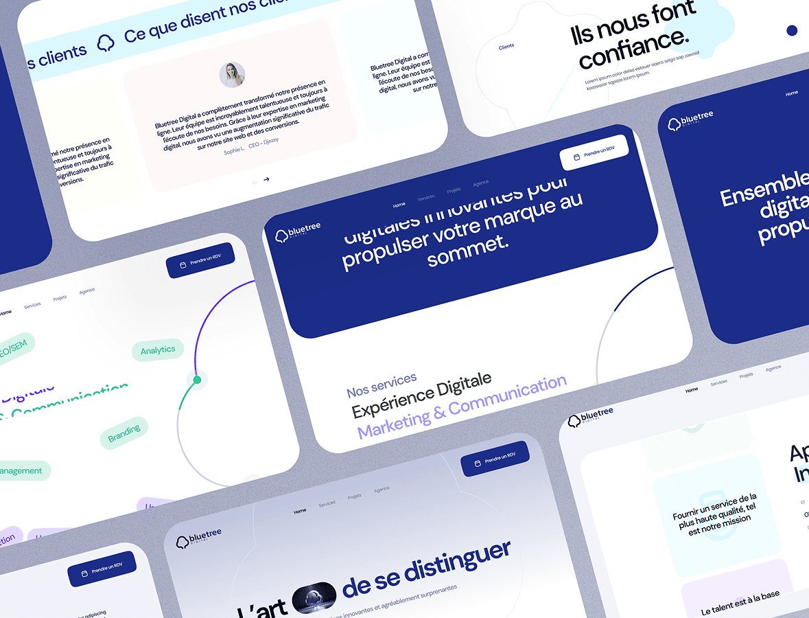
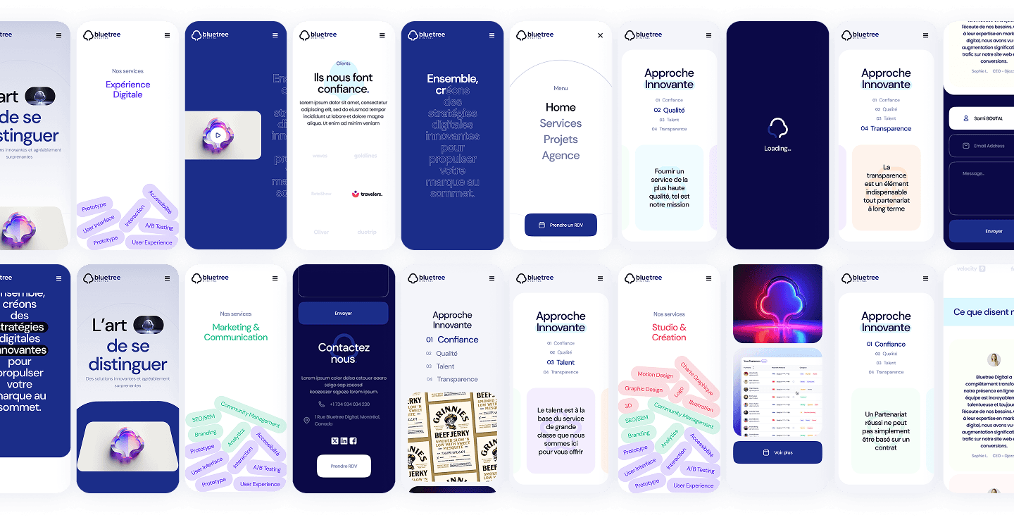
Bluetree is a creative agency known for its expertise in branding, digital content, and design. Their previous landing page no longer matched the agency’s energy, creativity, or the quality of their delivered work. I was tasked with redesigning their desktop and mobile landing page, with a strong emphasis on a clean visual identity, modern interactions, and a structured storytelling approach.
Problem & Goals.
The former landing page lacked:
- A strong visual identity
- Modern layout foundations
- Interactive elements
- Clear hierarchy or storytelling
Key sections were buried, and visitors struggled to understand Bluetree’s value proposition quickly. The page needed a complete redesign to better reflect the agency’s creativity and capabilities.
Challenge
Transform the old landing page into a modern, bold, and interactive experience that communicates Bluetree’s identity clearly while improving content structure and user engagement.
Research Phase.
1. Methods
Although this project was primarily visual, the process still included:
- Reviewing competitor websites and industry benchmarks
- Content audit of Bluetree’s existing site
- Usability review of the current layout
- Gathering requirements from the Bluetree team
2. Findings
From the analysis, we identified:
- Visual inconsistency across sections
- Weak hierarchy — services and portfolio weren’t highlighted enough
- Static experience lacking engagement or motion
- Need for a more premium, storytelling-driven layout
These insights guided the content architecture and visual direction for the new landing page.
“The old page looks static… I don’t immediately understand what the agency actually does.”
— User feedback
How might we create a bold, modern, and interactive landing page that showcases the agency’s creativity while improving structure and readability?
Ideation & Exploration.
Explorations focused on:
- A hero section with strong identity and visual storytelling
- Clear service categories with modular cards
- Portfolio previews designed to feel lively and immersive
- Subtle microinteractions and motion to reinforce craftsmanship
- A more modular layout to maintain consistency across devices
Each iteration balanced aesthetic impact with usability and hierarchy.
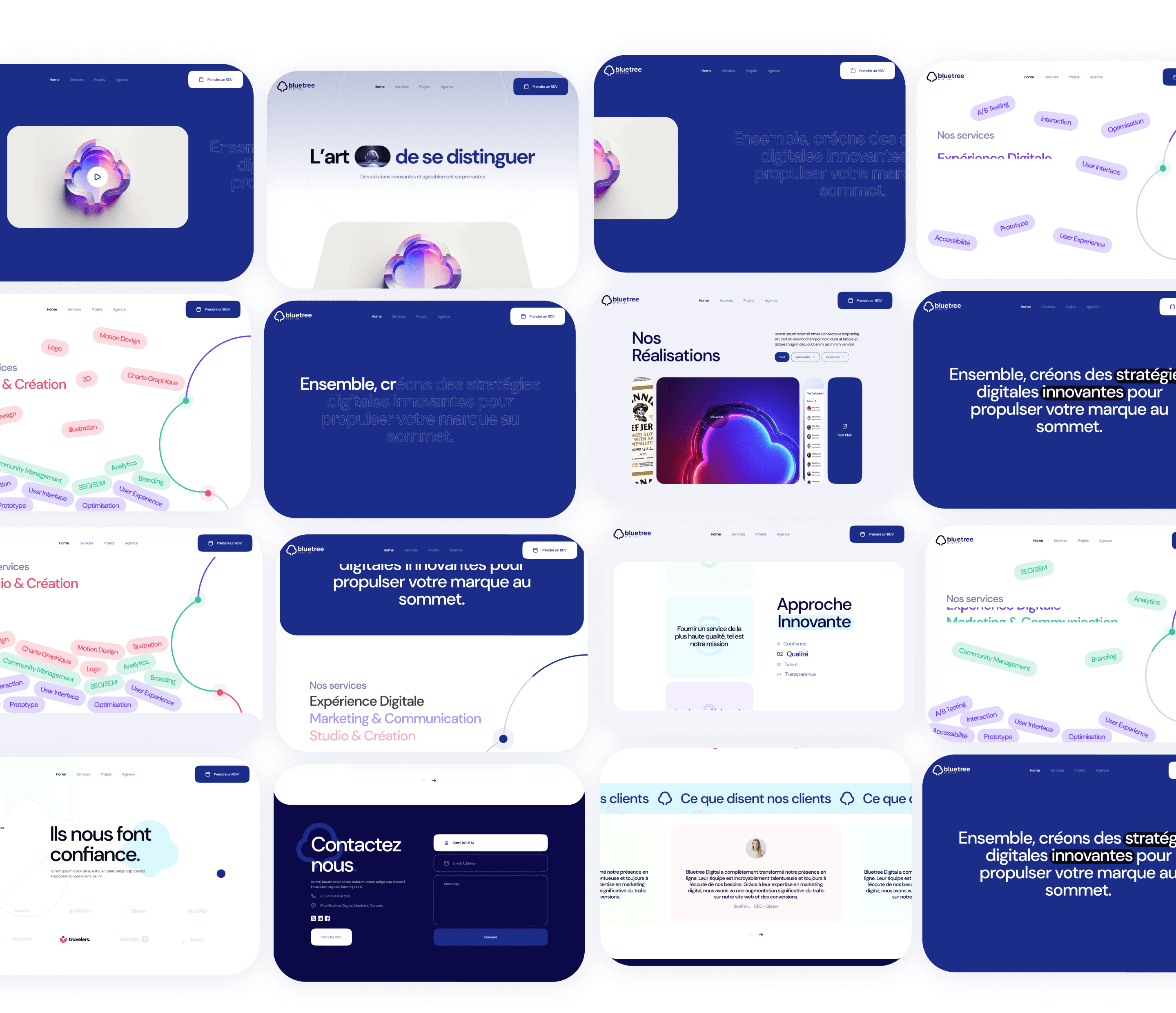
Final Design Highlights.
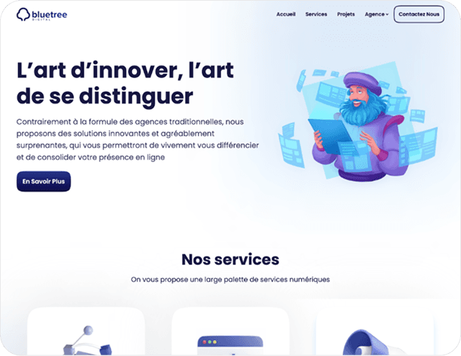
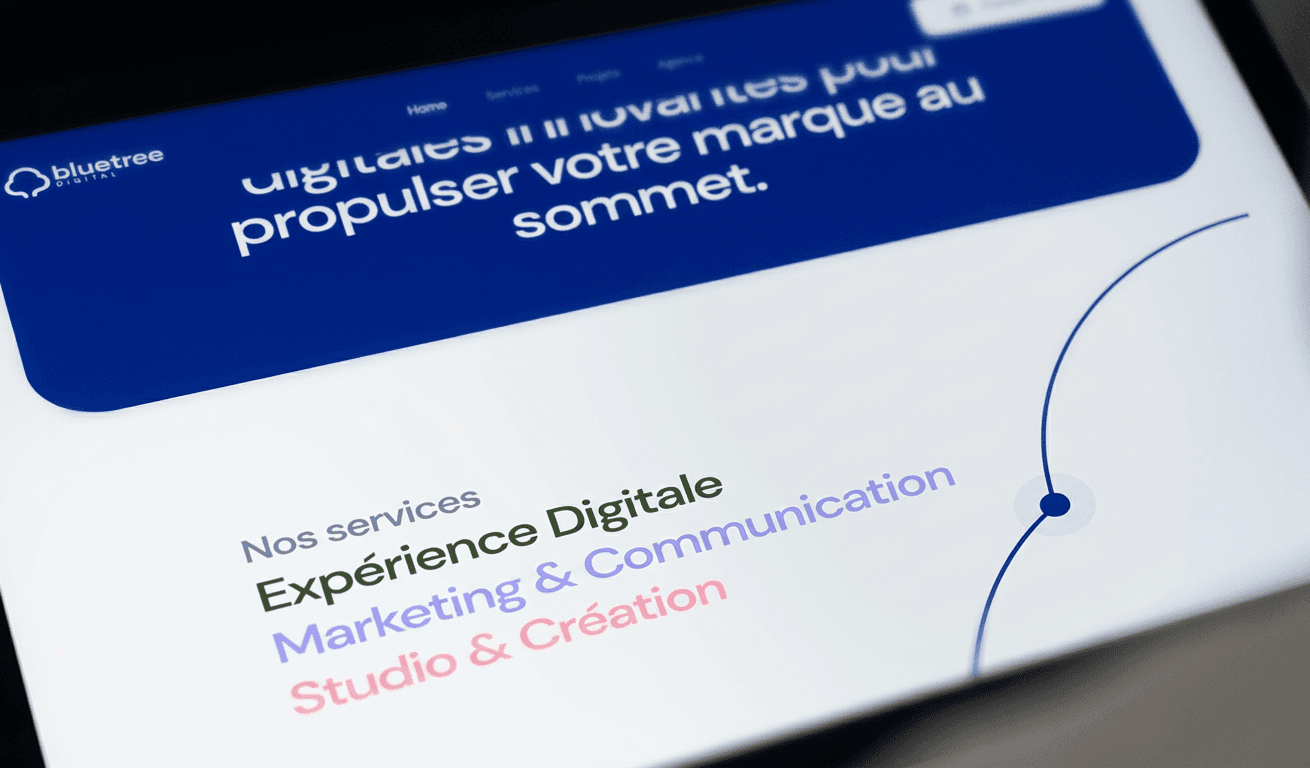
Bold Hero Section
A visually striking hero that immediately communicates Bluetree’s purpose and creative identity.
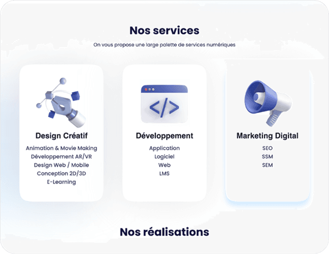
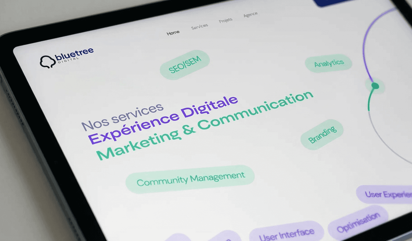
Structured Service Highlights
Clear categorization using modular cards, each supported with icons and short descriptions.
Portfolio Showcase
High-quality previews that make recent work more accessible and visually appealing.
Microinteractions & Motion
Animations were introduced to enhance flow and give the page a modern, polished feel.
Fully Responsive
The mobile experience was intentionally crafted — not just adapted — ensuring consistent hierarchy and impact across all devices.
Impact & Outcomes.
While this project does not include quantitative metrics, qualitative improvements included:
- Stronger brand identity
- Clearer storytelling and hierarchy
- More engaging interactions and transitions
- Improved readability across devices
- A more premium perception of the agency’s services
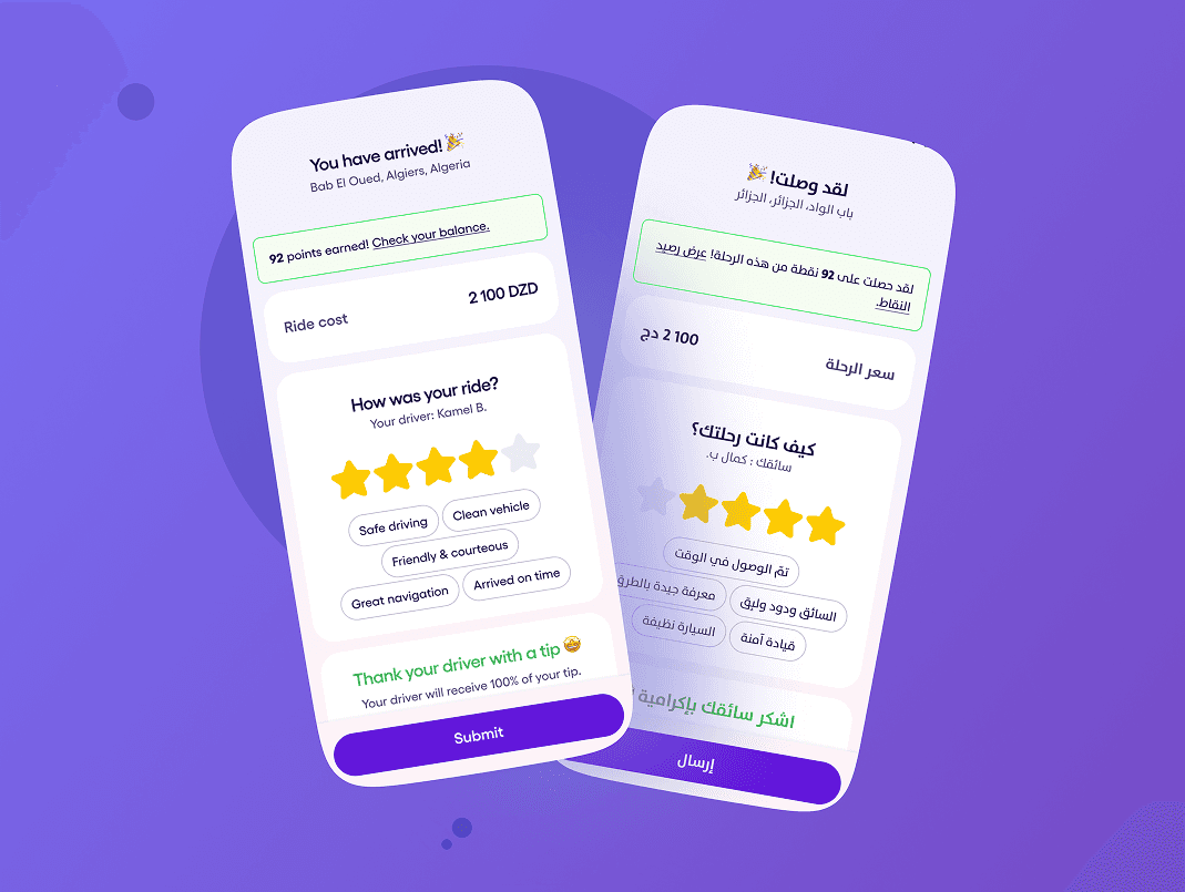
Post-Ride Experience