Post-Ride Experience
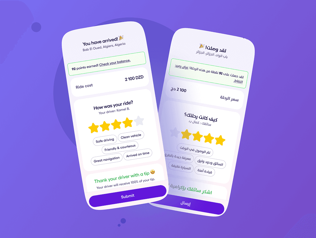
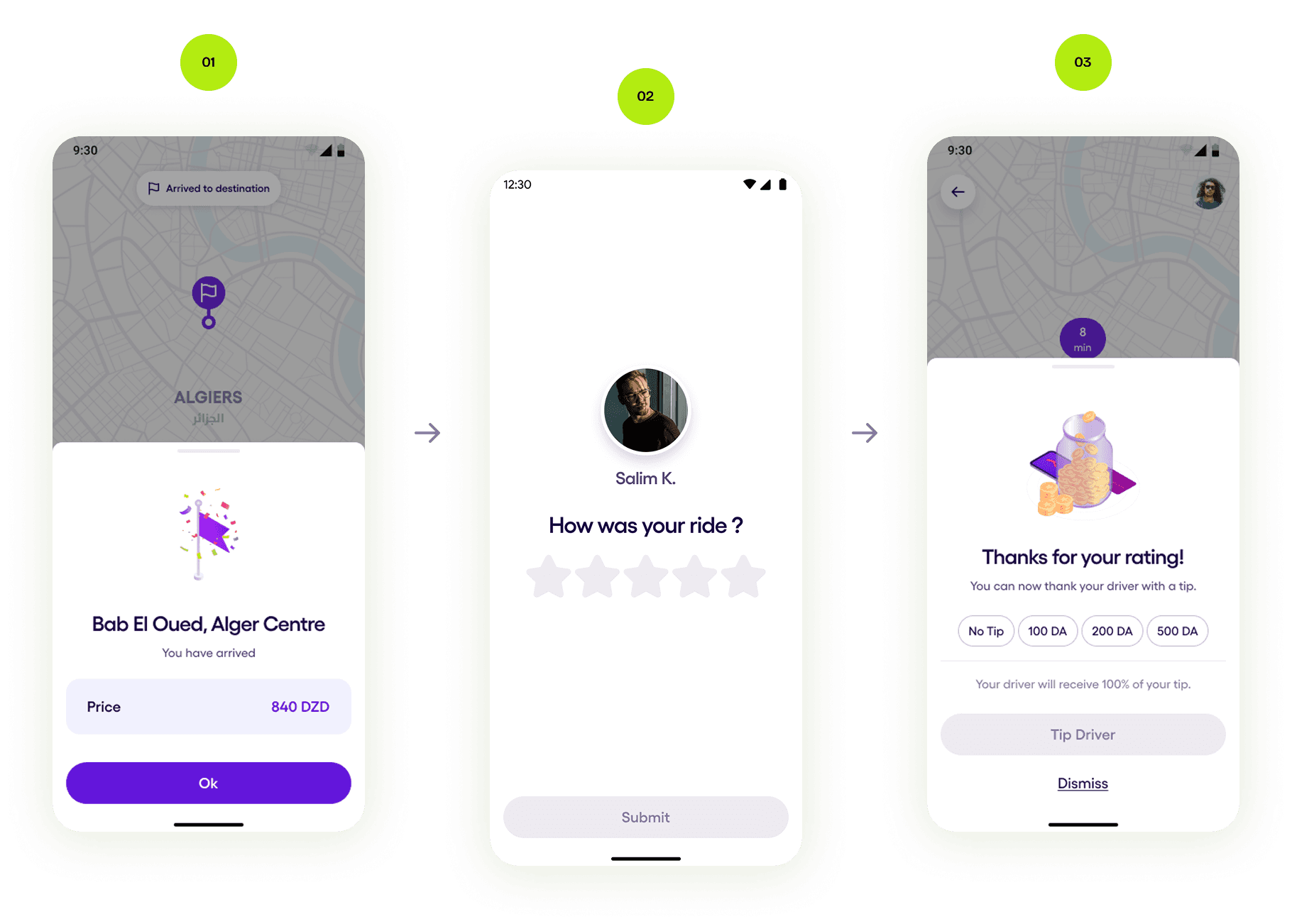
Yassir is the leading super app in North Africa, offering mobility, delivery, and financial services in one platform. This project focuses on improving the post-ride experience inside the Yassir Rider App. Previously, users had to go through three separate screens after each ride: Payment → Rating → Tip. This created unnecessary friction, low engagement, and a generally static end-of-ride moment. The primary goal was to streamline the entire flow into a single interactive screen to boost completion rates, feedback quality, and tipping behavior.
Problem & Goals.
Analytics revealed a significant drop-off immediately after rides:
- Only 63% of users completed payment
- Less than 30% made it to the rating screen
- Fewer than 10% left a tip
Users reported that the three-step flow felt slow, unnecessary, and unclear. There was no emotional closure, no sense of finishing the ride, and no motivation to continue to rating or tipping.
Challenge
Create a faster, more rewarding, and more efficient post-ride experience that increases feedback and tipping without adding friction.
Research Phase.
Methods
- Analytics Review
- Usability Testing (10 participants)
- In-App Survey
- Benchmark Study
Findings
- Users felt high cognitive friction moving through three separate steps
- No emotional feedback or celebratory moment
- Weak hierarchy — unclear when the process ended
of tested users preferred a single, unified post-ride screen
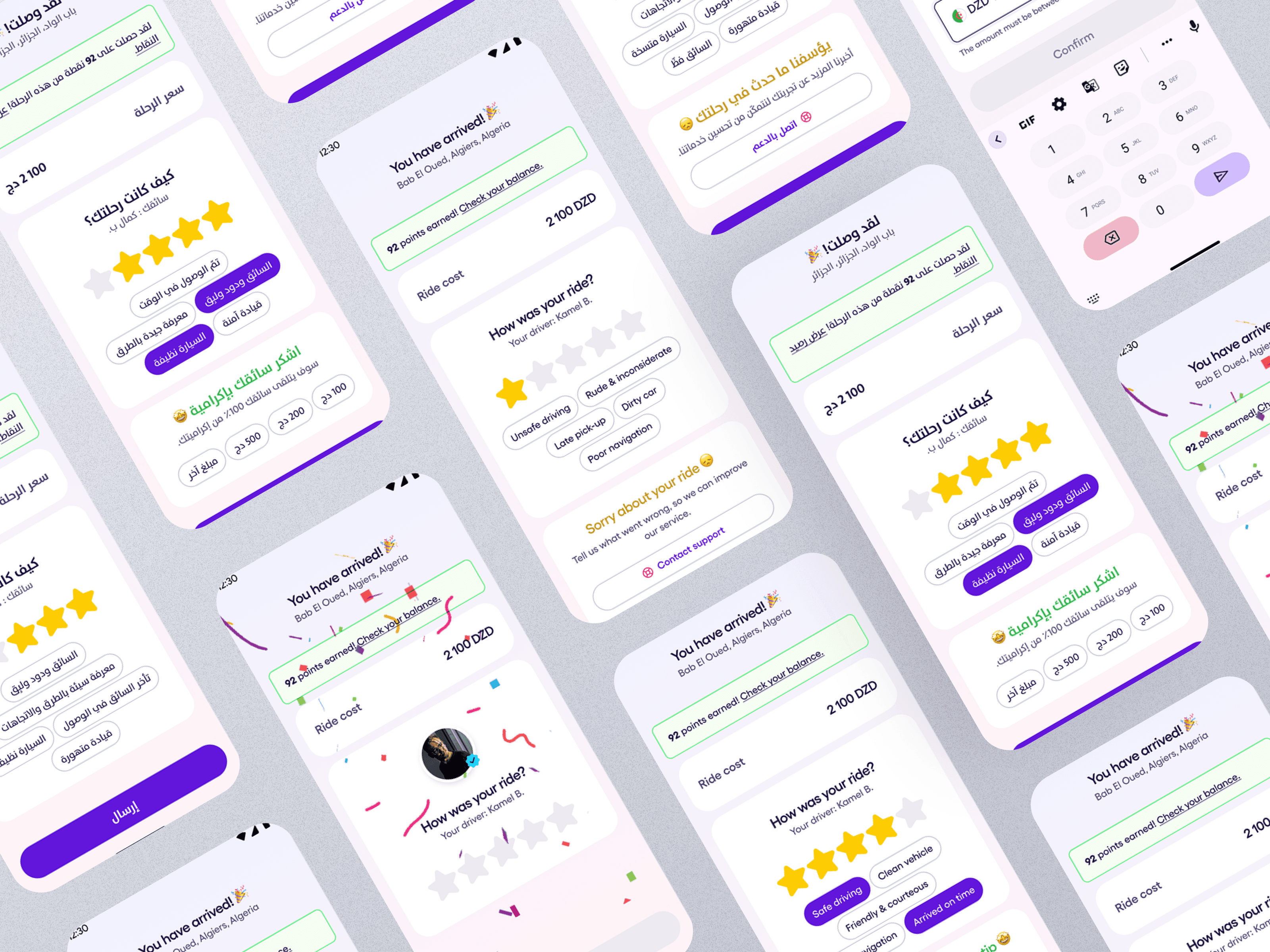
“It feels like too many steps just to finish a ride. I don’t have time for all that.”
— User feedback
How might we make the post-ride experience simpler, faster, and more emotionally satisfying?
Ideation & Exploration.
We explored multiple layouts and interaction patterns to combine payment, rating, and tipping into a single, intuitive screen.
Design explorations included:
- Completing payment automatically with visual confirmation
- Progressive disclosure for ratings and tipping
- Animated transitions to guide the user through the flow
- Stronger hierarchy to show what’s done and what’s next
Each iteration aimed to reduce friction while reinforcing clarity and reward.
Prototyping & Testing.
We developed a high-fidelity prototype and tested it with 20 active riders.
What we learned
said the consolidated flow “felt faster and easier”
completed both rating & tip within 10 seconds
- The unified screen significantly reduced hesitation and confusion
- Final interactions matched user expectations with minimal learning curve
Final Design Highlights.
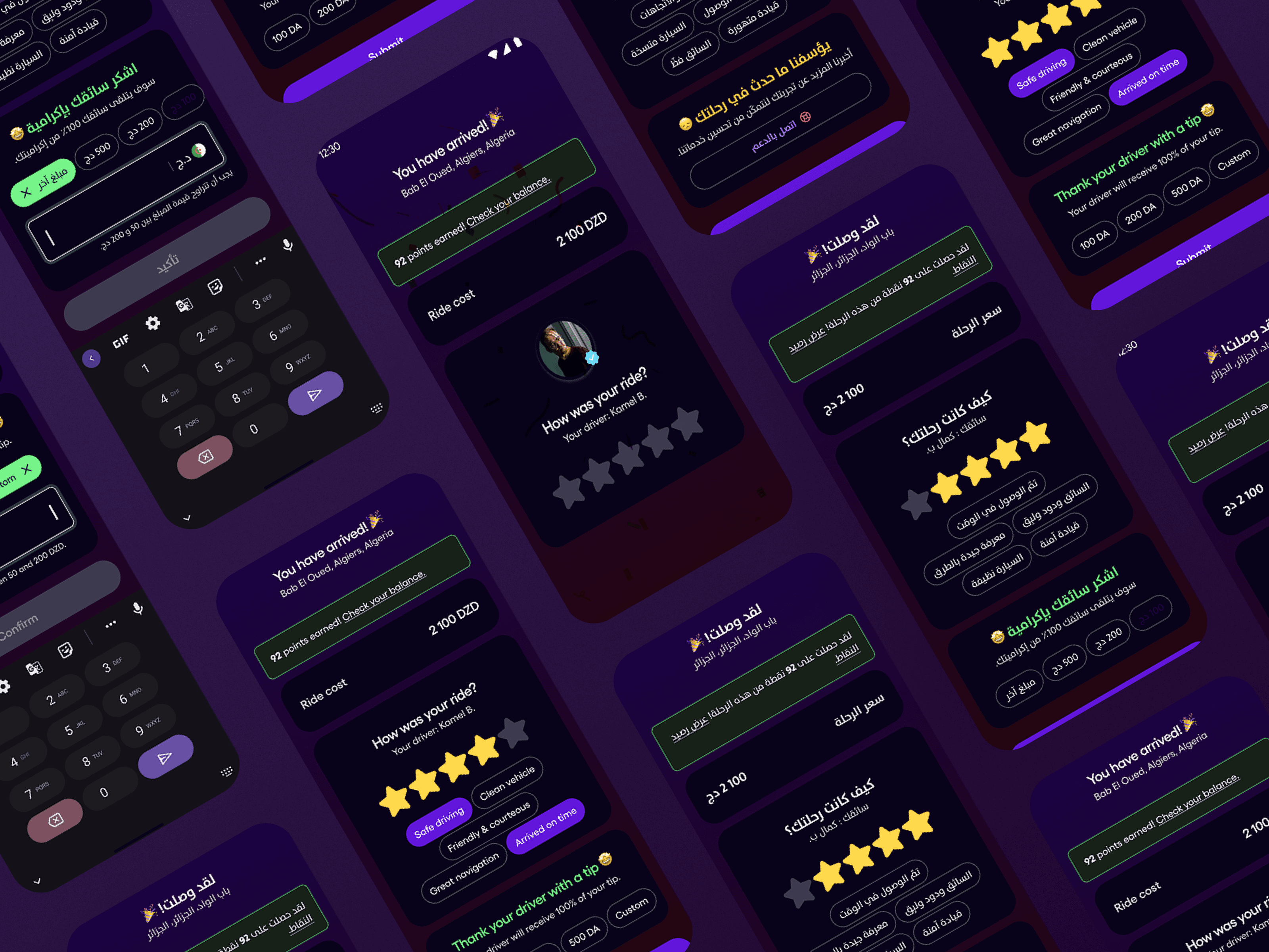
Unified Post-Ride Flow
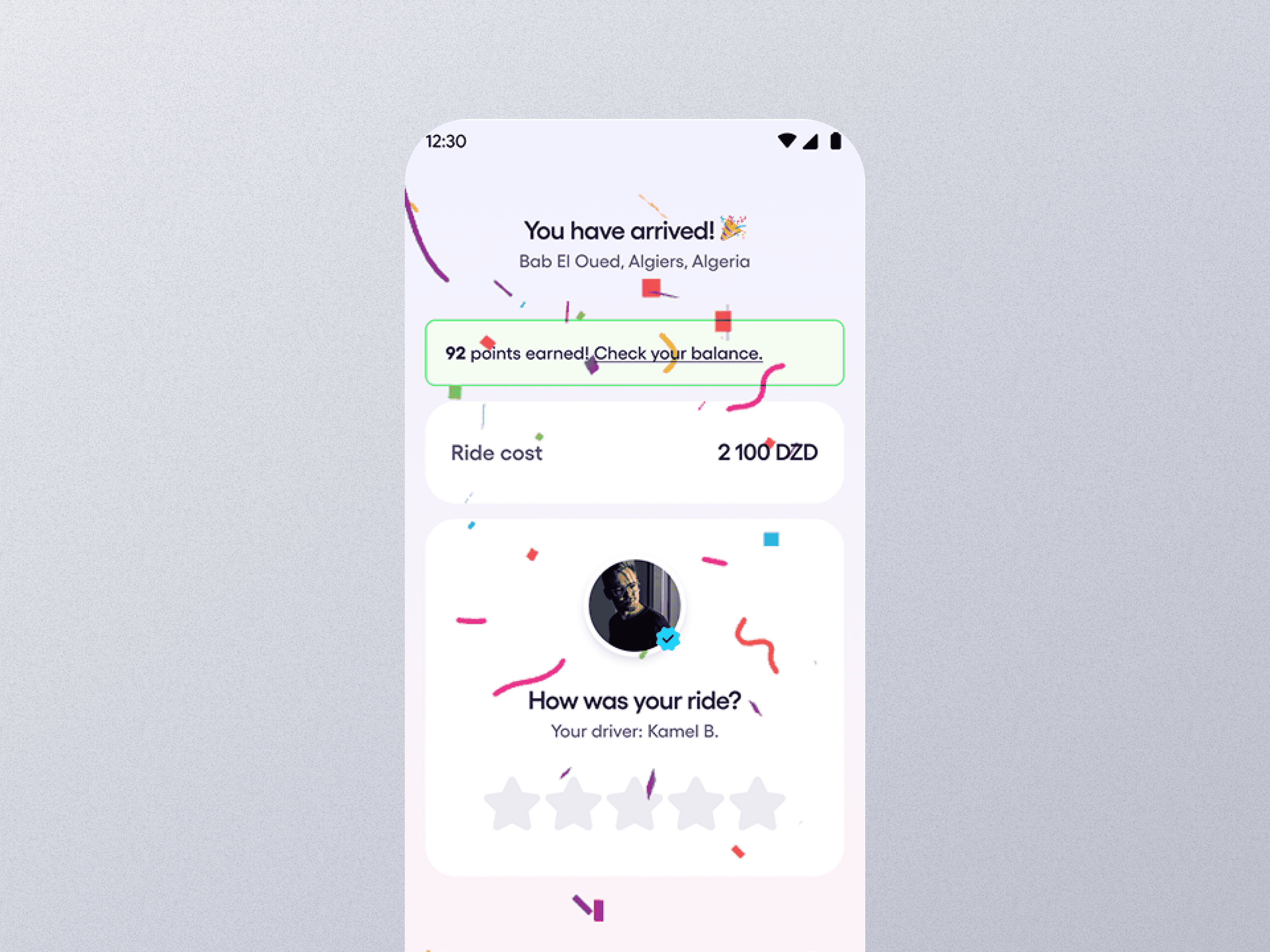
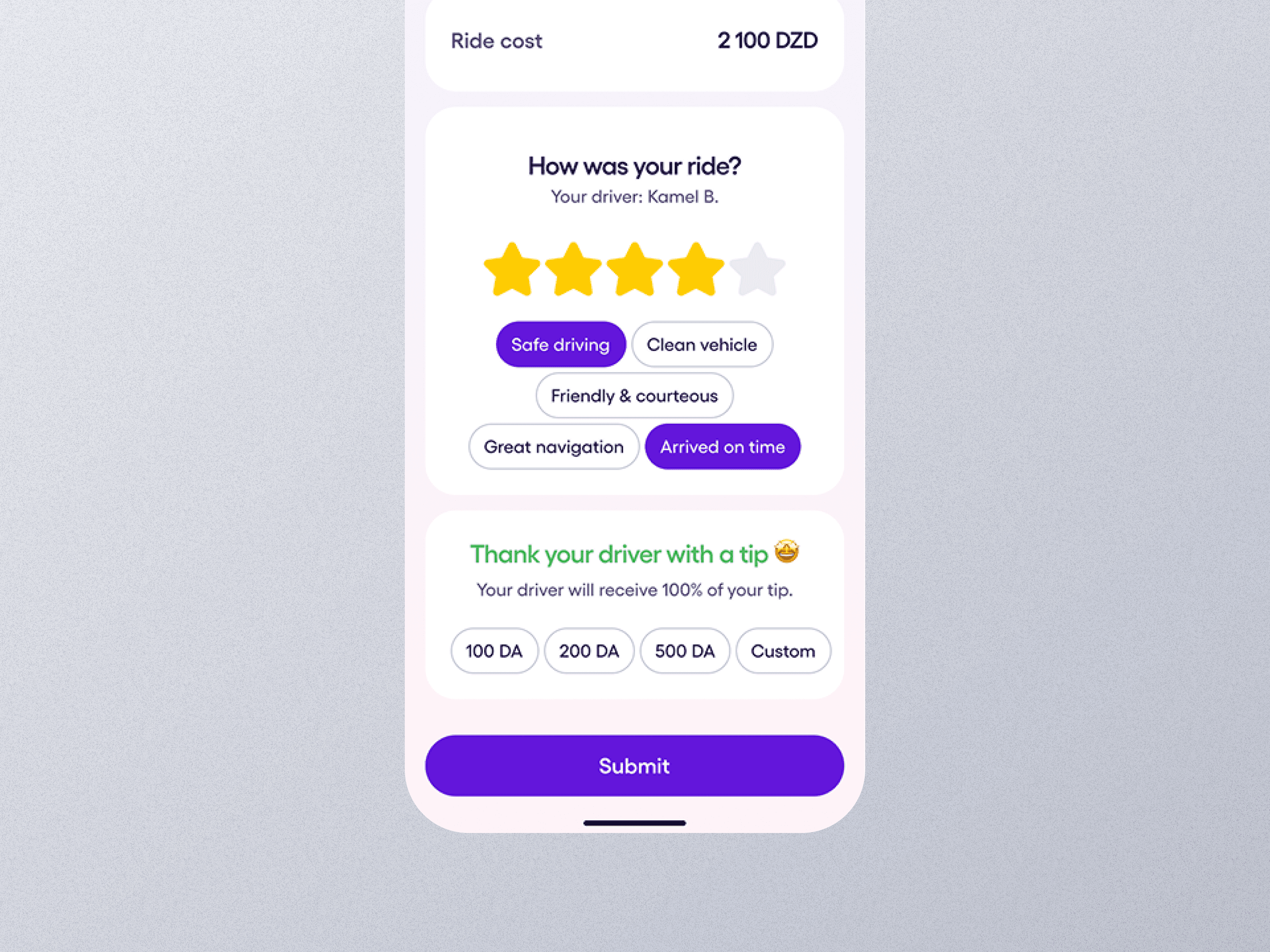
A single screen combining payment confirmation, driver rating, and tipping options.
Clear Hierarchy
The sequence follows a guided, top-down logic: Payment → Rating → Tip. Each step visually reinforces completion.
Micro-Interactions
Soft animations and transitions add momentum and emotional closure.
Faster Completion
The entire flow is designed to be finished in under 10 seconds.
Impact & Outcomes.
Data measured after 4 sprints:
Post-Ride Completion (63% → 91% (+44%))
Rating Participation (29% → 85% (+56%))
Tip Conversion (9% → 33% (+24%))
The redesign drastically improved engagement, reduced friction, and created an emotionally satisfying end-of-ride moment for users — while increasing driver earnings through higher tip conversions.
GoAmigo MVP